BOLLINGER
GROUPE
Cultivating Rarity
-
CLIENT
Groupe Bollinger
Independent family-owned wine group.SCOPE
Brand strategy and positioning.
Tagline creation — “Cultivating Rarity.”
Corporate identity and brand guidelines.
Creative direction, photography and illustration.
Web design, digital art direction and copywriting.Website : www.groupebollinger.fr
CONTEXT
Founded in 1829, Groupe Bollinger brings together exceptional wine estates in France and abroad. The challenge was to give the Group a distinctive identity of its own — one capable of expressing a shared culture of independence, craftsmanship and terroir while respecting the singularity of each House.CREATIVE DIRECTION
Cultivating rarity. A timeless identity rooted in the landscape and shaped by the values of transmission, independence and respect for nature.TEAM
Creative direction — Emma Brante & Masha Kontchakova
Tagline — Emma Brante
Logo & visual identity — Emma Brante
Corporate illustration — Emma Brante
Photography — Masha Kontchakova
Web design & digital art direction — Emma Brante
Web development — Lara Mueller
A FAMILY GROUP, ONE SHARED IDENTITY
Creating a distinctive corporate identity for an independent family-owned group, bringing together exceptional wine estates under a shared vision while preserving the singularity of each House.

Cultivating
Rarity
A VISION OF LUXURY
“Cultivating Rarity” became the expression of the Group’s positioning. The idea of cultivation connects its roots in the land with a broader commitment to preserve what is exceptional — rare terroirs, craftsmanship and independent Houses. A vision of luxury defined not by ostentation, but by nature, time and transmission.

A SYMBOL BUILT TO LAST
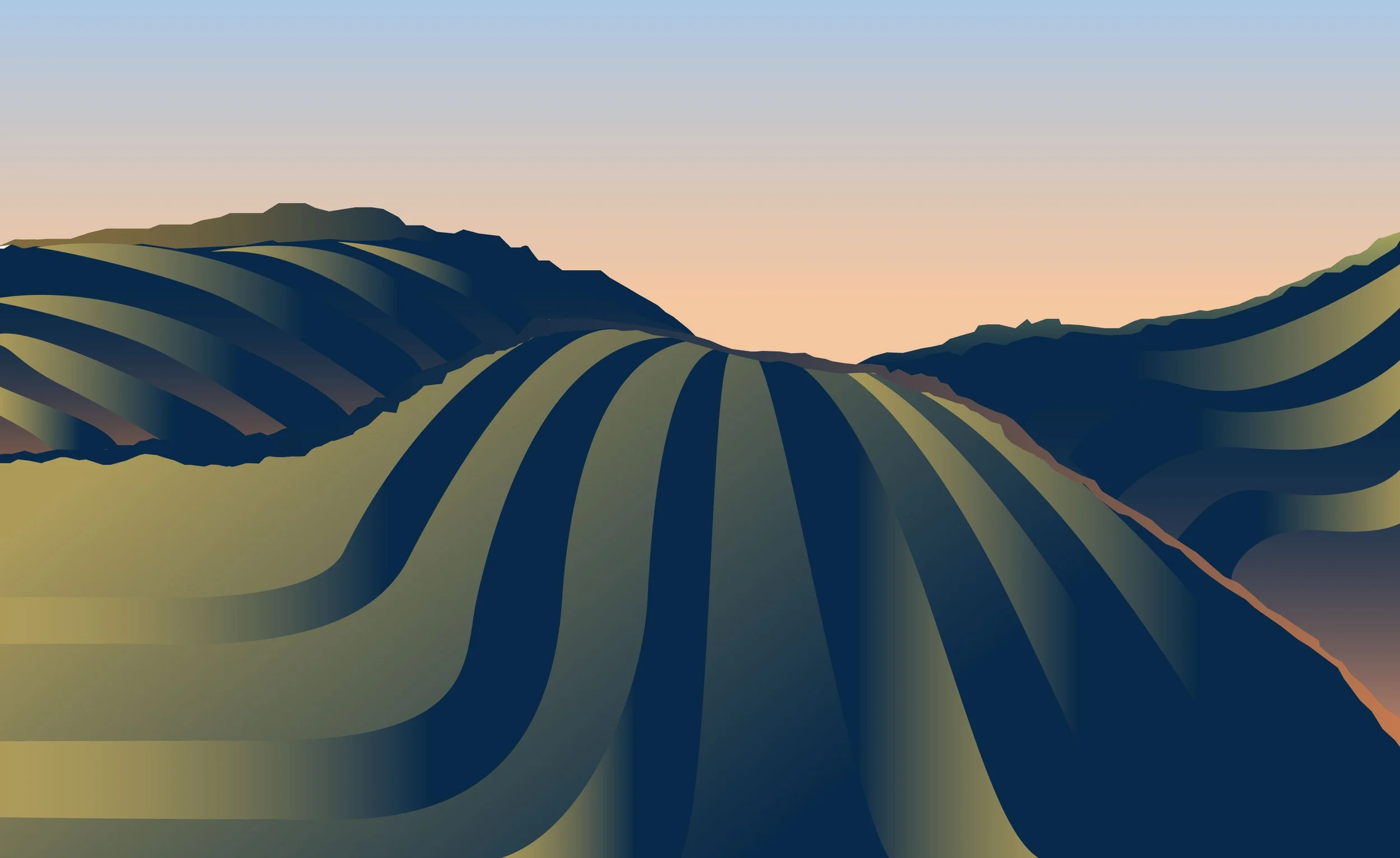
Inspired by the geometry of vineyard rows, the emblem translates the Group’s foundations — terroir, transmission and independence — into a timeless mark.

FROM IDENTITY TO EXPERIENCE
The visual language extends across corporate communication and digital experience, creating a coherent presence for the Group while allowing each House to retain its own identity.

ROOTED IN NATURE
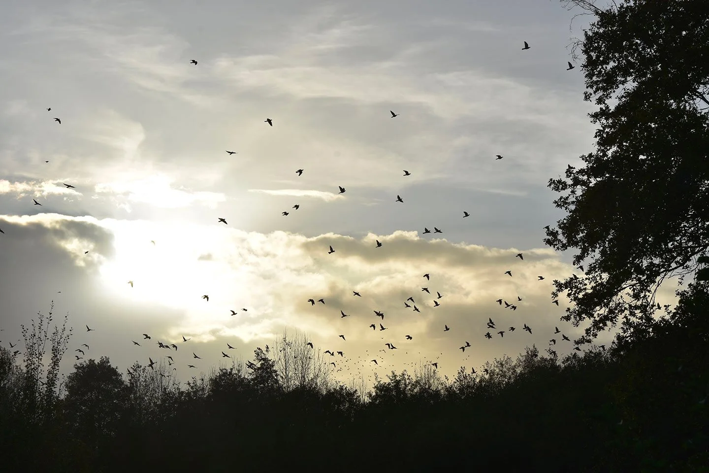
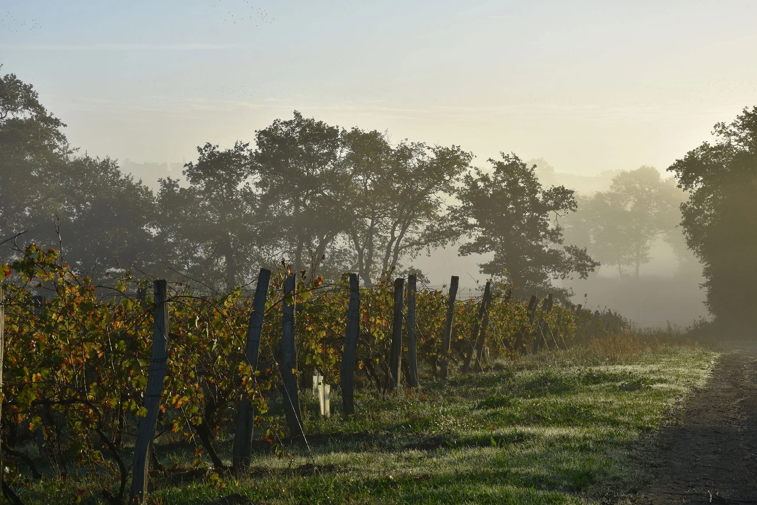
A restrained visual language shaped by landscape, light and living matter — expressing a vision of luxury grounded in nature rather than ostentation.