LA CHAMBRE
PARIS
Tradition, Lived Lightly

-
CLIENT
La Chambre — ParisSCOPE
Brand Strategy, Naming, Creative Direction, Brand Identity, Photography, Packaging, Digital Art DirectionCONTEXT
La Chambre was conceived as a new Parisian home linen brand, built around an essential object: the bed. In a category dominated by product and performance, the ambition was to create a distinctive world — intimate, tactile and immediately recognisable.CREATIVE DIRECTION
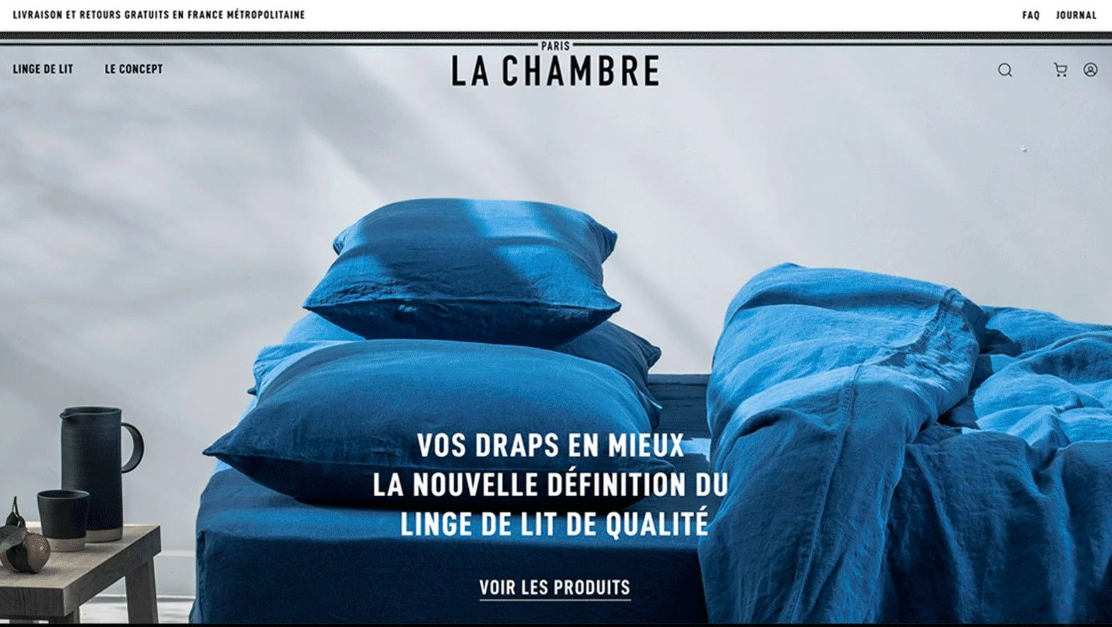
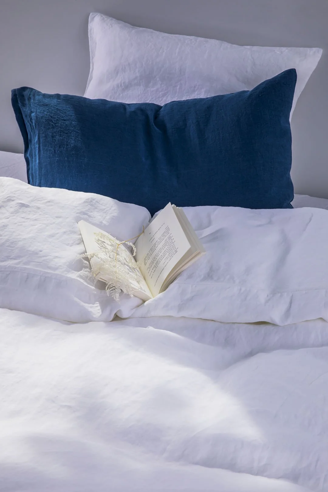
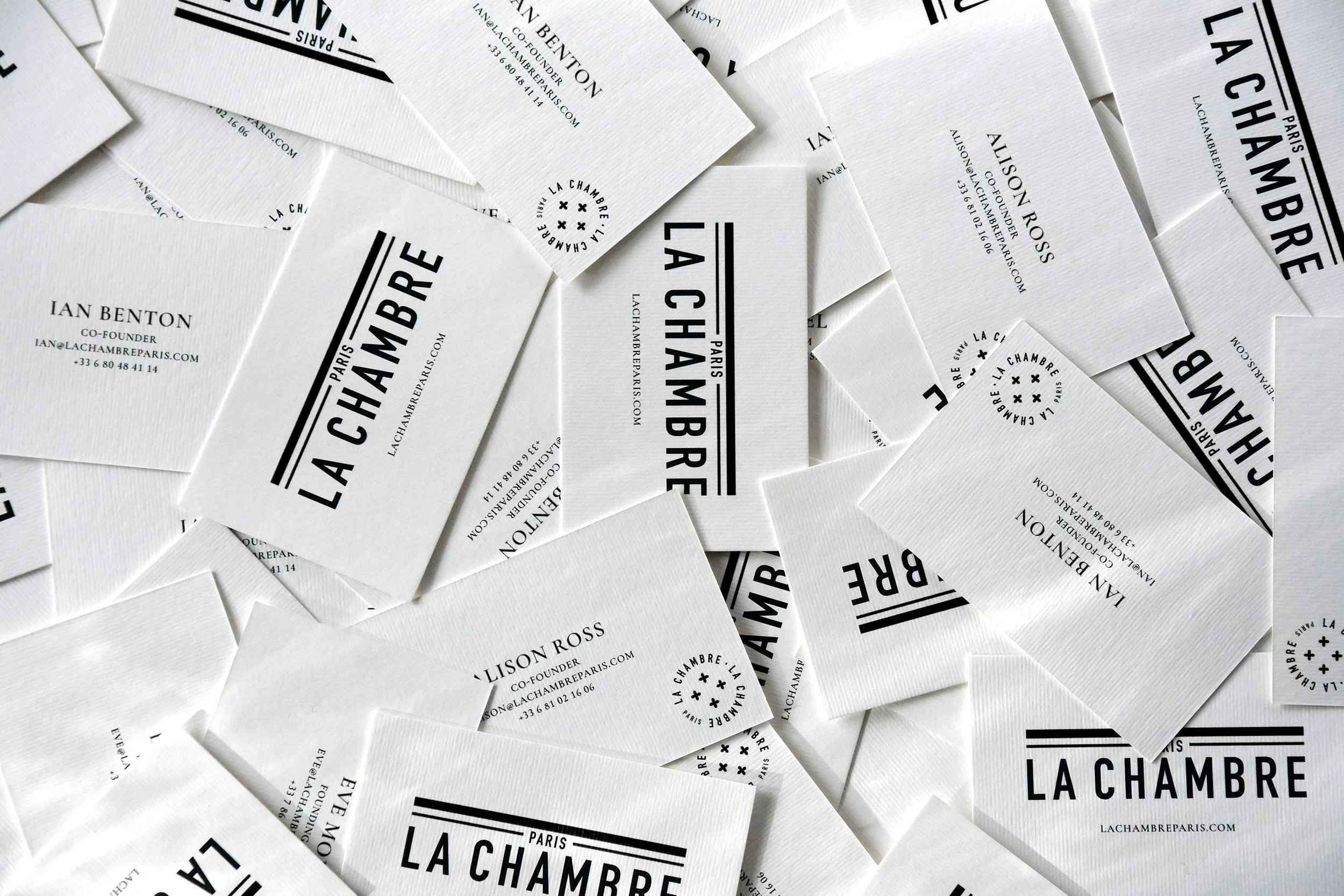
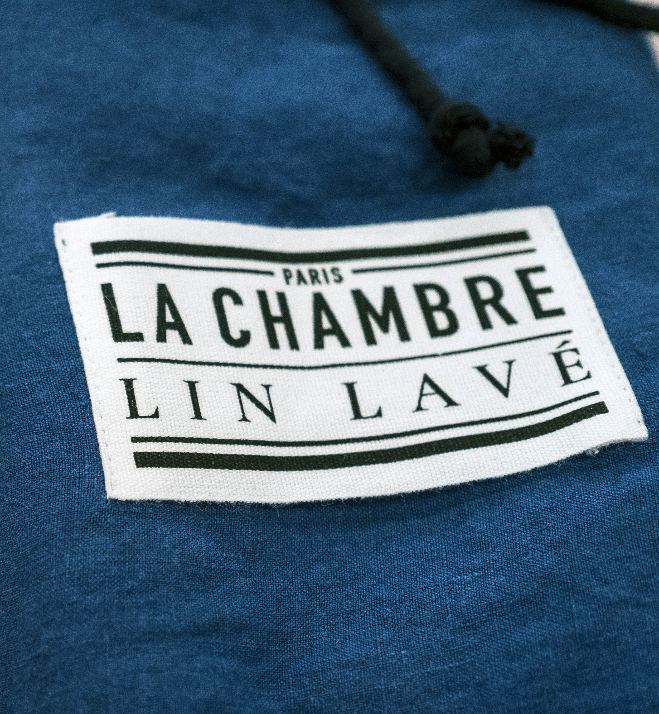
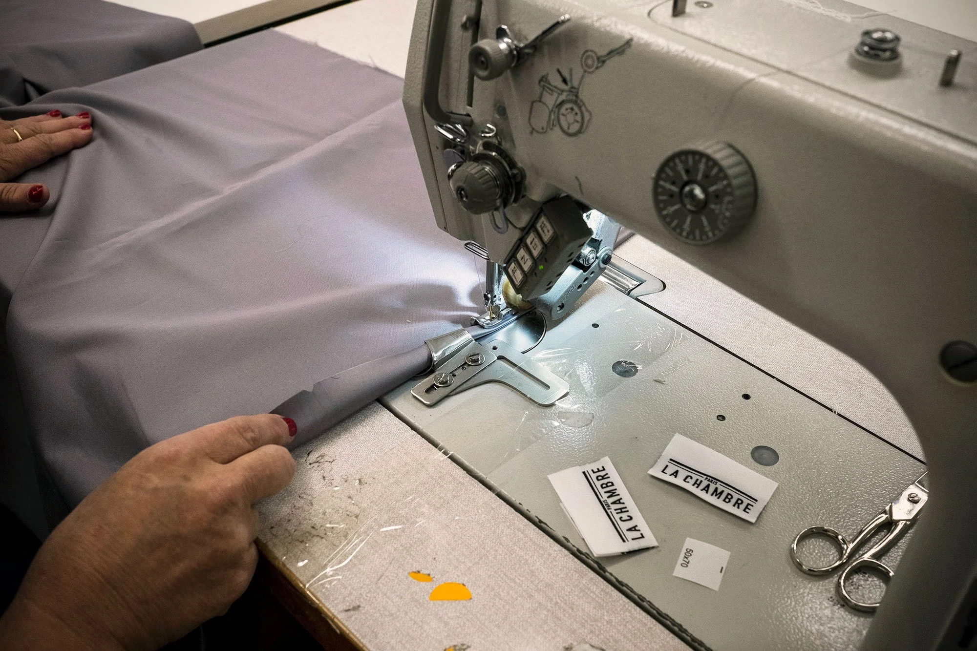
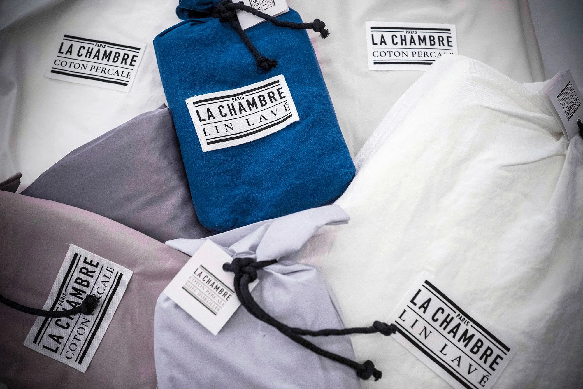
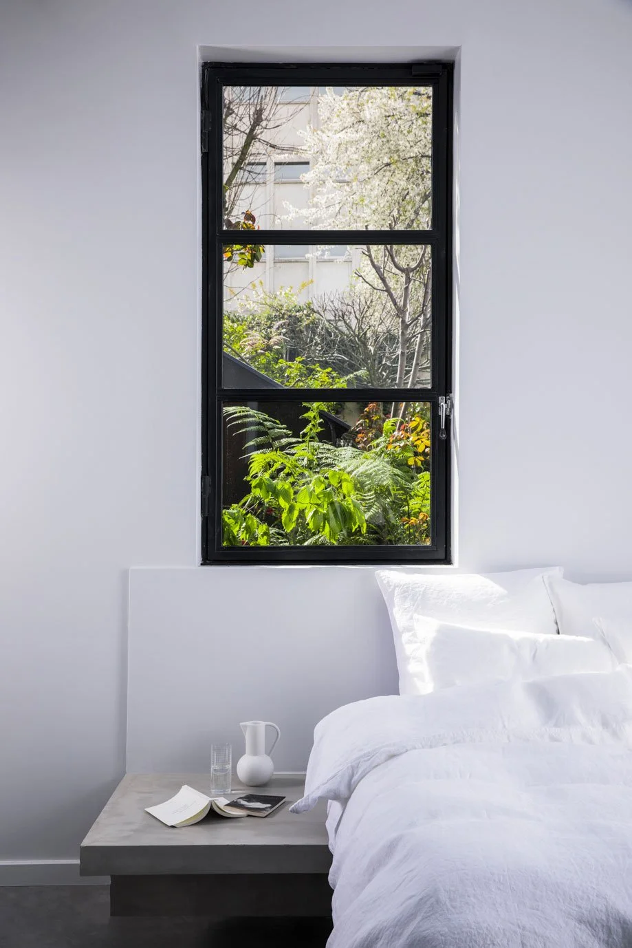
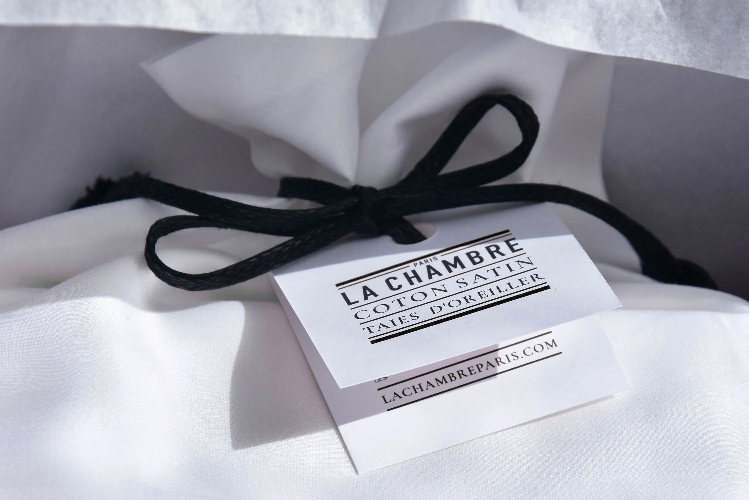
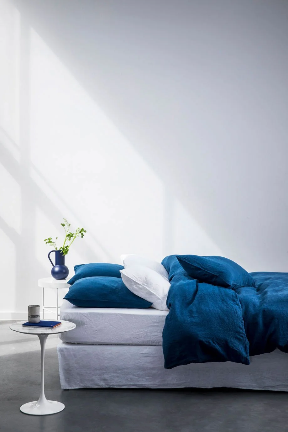
The identity draws from the visual language of traditional French household linen: woven labels, stitched markings, double rules and typographic stamps. Reinterpreted as a contemporary system, these familiar codes became the grammar of the brand — from the label sewn into the fabric to packaging, photography and digital experience.The art direction extends this idea through light, texture and domestic fragments. Rather than presenting linen as isolated product, the imagery evokes a room, a gesture, a moment — building a quiet, sensual world around the brand.
OUTCOME
A complete brand world conceived from the name to the digital experience, with one visual language carried across every point of contact.TEAM
Creative Direction — Emma Brante & Masha Kontchakova
Brand Strategy & Naming — Emma Brante
Brand Identity & Graphic Design — Emma Brante
Photography Art Direction — Masha Kontchakova
Digital Art Direction, UX & Visual Design — Emma Brante & Masha Kontchakova
A ROOM OF ONE’S OWN
La Chambre began with a simple idea: to build a world around the bed.
Conceived as a contemporary Parisian linen house, the brand takes the bedroom itself as its territory — its light, its architecture, its textiles and the intimate rituals that inhabit it.

A PARISIAN LANGUAGE
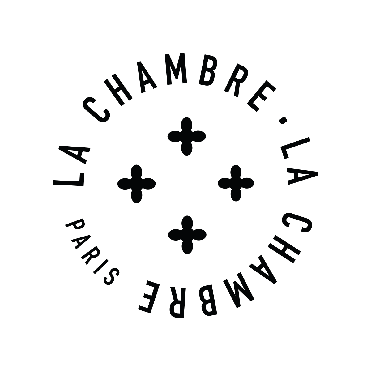
The identity draws on two familiar languages: the architectural details of Haussmannian Paris and the graphic codes of traditional French household linen. Double lines echo both Parisian mouldings and the borders of domestic textiles, while cross-stitch references inform the emblem. Together, these elements are composed into a new visual language — rooted in familiar codes, yet distinctly contemporary.
MAKING TEXTURE TANGIBLE
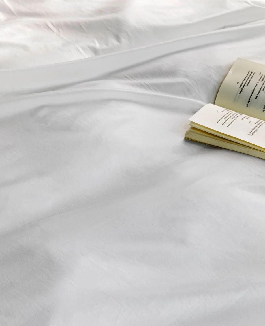
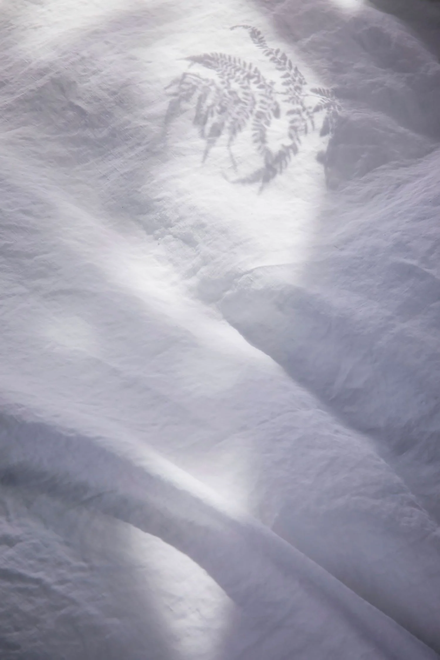
Created for an e-commerce experience, the photographic direction was conceived to convey what the screen cannot: the tactile quality of the fabric. Light, composition and close-up details reveal its texture, softness and drape — turning a visual experience into an almost sensory one.
FROM IDENTITY TO EXPERIENCE
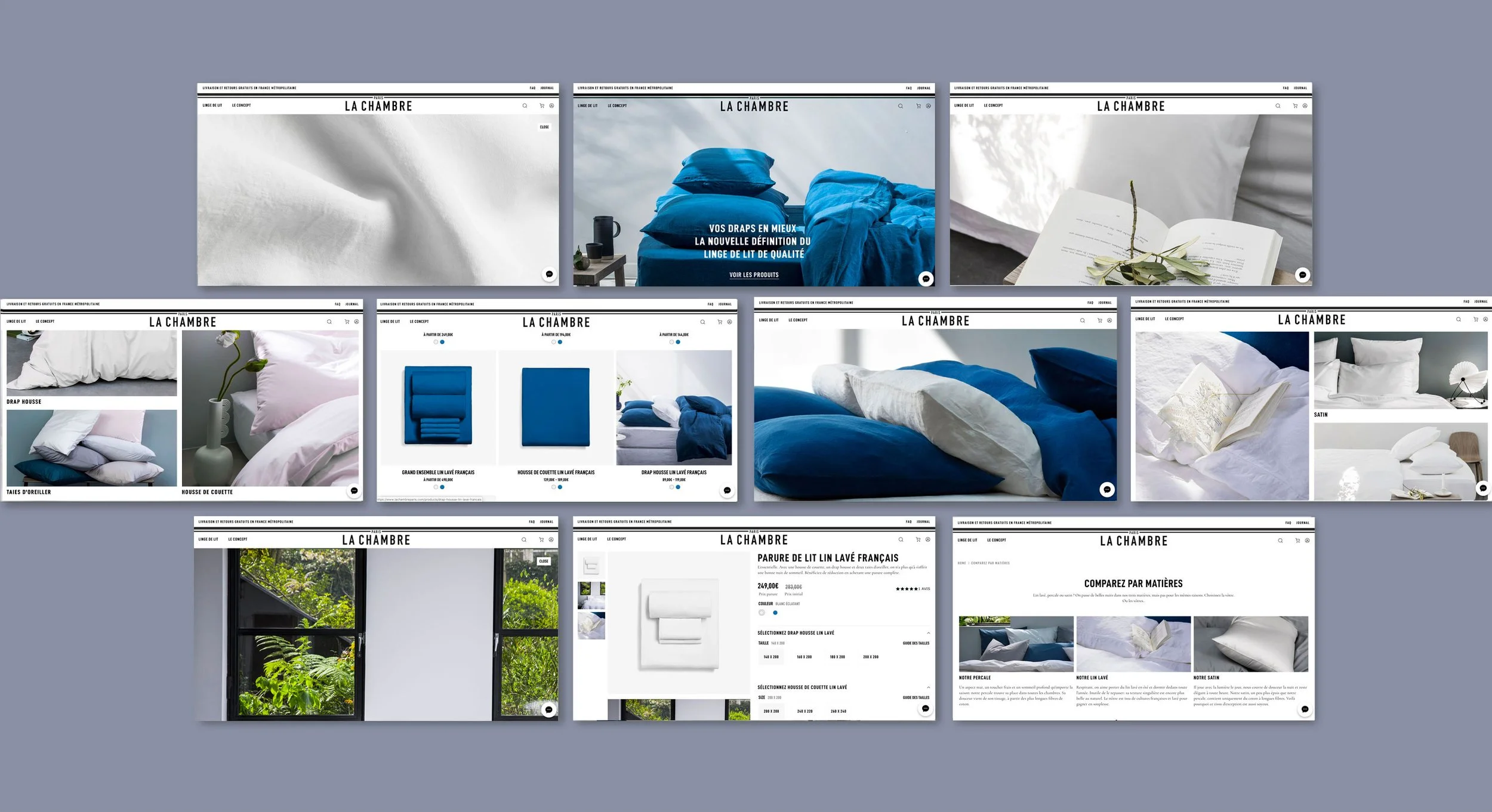
The digital experience brings every element of the brand together — identity, photography, product and packaging — into one coherent world. Designed as a natural extension of the visual language, the website turns each touchpoint into part of a continuous brand experience.